Support Mantine development
You can now sponsor Mantine development with OpenCollective. All funds are used to improve Mantine and create new features and components.
Sponsor MantineMigration guide
This changelog covers breaking changes and new features in Mantine 10.0. To migrate your application to Mantine 10.0, follow 9.x → 10.x migration guide.
@mantine/data-grid package
New @mantine/data-grid package provides a data grid built on TanStack Table with sorting, filtering, pagination, editing, virtualization and server-side data:
ImageCropper component
New ImageCropper lets users pan, zoom, rotate and flip an image inside a rectangular or circular crop window.
Export the crop as a Blob or data URL, or use its coordinates to crop the image on the server:

Timer component
New Timer displays a countdown or stopwatch with controls to pause, resume and restart it.
Use useTimer on its own or build a custom layout with Timer:
Editable component
New Editable lets users edit text in place. Press Enter to save or Escape to cancel, or add buttons for both actions:
FileSize component
New FileSize displays a byte count in a readable format, such as 1.45 kB.
Use formatBytes to get the same localized value as a string:
| File | Size |
|---|---|
| avatar.png | 15.36 kB |
| report.pdf | 1.45 MB |
| backup.zip | 4.8 GB |
CodeHighlightFileTree component
New CodeHighlightFileTree component displays
multi-file code with a file tree instead of tabs. / in fileName creates folders, the active
file can be controlled with activeFile and onActiveFileChange props, and below hideTreeBelow
breakpoint the tree is replaced with a select:
Component controllers and stores
Use a controller to trigger component actions from your own controls. For example, useAccordion lets a button expand all items:
Expanded: none
Use a store to build on an existing component. For example, useSelect lets you build a select that creates new options:
Theme editor
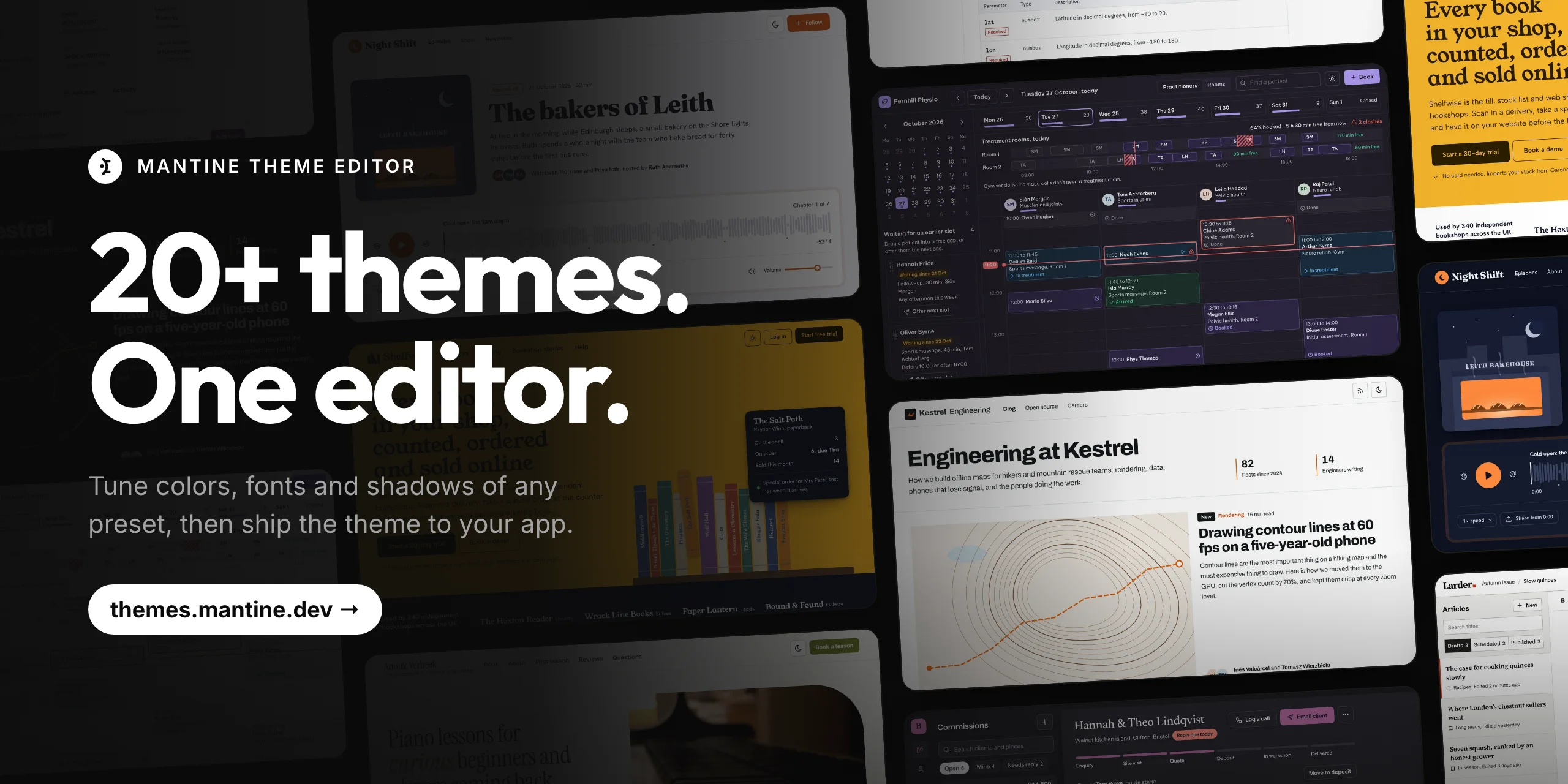
New theme editor lets you build a theme from ready-made presets and preview it on real pages. Adjust colors, fonts, spacing and shadows, then copy the theme code or a prompt for your coding agent.
OKLCH default palettes
Default colors are regenerated in the OKLCH color space: shades with the same index now look
equally bright in every color. Existing color names and the number of shades are unchanged,
see the migration guide if you parse --mantine-color-* variables.
Colors generator
generateColors from @mantine/colors-generator now returns OKLCH colors and keeps the input color
in the palette. The second argument adjusts lightness, saturation and hue of the generated shades,
see colors generation. The online tool moved to
themes.mantine.dev/colors-generator, it has presets and a
separate palette for dark color scheme:
Neutral color
New neutral color is black in light mode and white in dark mode.
Use color="neutral" on individual components or set primaryColor: 'neutral' in your theme:
Neutral color ladder
New --mantine-color-neutral-0 to --mantine-color-neutral-9 variables adapt to the color scheme.
Use them in custom CSS instead of separate gray and dark shades:
Dark neutral flavors
New darkColdColors, darkWarmColors and darkTintedColors palettes change the tone of the dark
color scheme. Assign one of them to theme.colors.dark:
Neutral shades tint
New grayWarmColors and grayColdColors palettes provide warm and cold neutrals for the light color scheme.
Use mixNeutralColors from @mantine/colors-generator to blend your primary color into neutral shades:
tintColors utility
New tintColors function mixes a color into every shade of the dark palette:
Semantic color CSS variables
Override semantic color variables to restyle components together. For example, change every focus ring in dark mode:
Surface component
New Surface component replaces Paper, which is deprecated and will be removed in 11.0.
Nested surfaces step up one level automatically, so elevation is visible in dark mode:
Use the surfaces theme key to change surface colors for each color scheme:
Inputs share one surface token
Inputs, checkboxes, radios, Dropzone and RichTextEditor now share the --mantine-color-surface-input
variable, which is white in light mode and dark-7 in dark mode. The editor matches the other inputs,
and one override restyles all of them. Change it with the surfaces theme key:
Dropdowns render on the page surface
Dropdowns of Popover, Menu and Combobox based components now use the page background, like Modal.
In dark mode they are darker than before and are separated from the content with a border and a shadow.
Sunken surfaces, code surfaces and control tracks
Segmented controls, contained tabs and scrollbars now share one sunken surface color.
Code elements share one muted surface color, and tracks of switches, sliders and progress bars
use the new --mantine-color-track variable.
autoContrast enabled by default
Filled components now pick black or white text to match their background color.
Set autoContrast: false in the theme to restore the previous behavior.
Disabled state opacity
Disabled components now look like a faded version of their normal state instead of turning gray.
Change the opacity with theme.disabledOpacity:
use-form engine and uncontrolled mode
useForm is now uncontrolled by default. Typing rerenders only the input, not the whole form,
and form.key() is no longer needed:
New form.useDirty and form.useTouched hooks subscribe a component to dirty and touched state,
and custom inputs subscribe to a field with the useFormField hook.
See uncontrolled mode for details.
Reusable form fields
New form.getField('path') returns a field object with the same type as useField.
A component that accepts it works with any form, see reusable fields:
Conditional validation
New when validator runs a rule only when the condition returns true.
Use it for fields that are required depending on another field, see validators:
Focus form inputs
form.focusInput(path) focuses an input or a control inside a group, such as Radio.Group.
Use it to focus the first invalid field on submit, see form submission:
Virtualized combobox dropdowns
Pass a virtualizer component to render large dropdowns with the scrolling library of your choice.
It works with the following components:
- Autocomplete, Select, MultiSelect, and TagsInput
- ComboboxPopover, TreeSelect, and the PhoneInput country picker
- Mentions overlay suggestions and Cascader flat lists
This Autocomplete lets you search and navigate 10,000 options while rendering only the visible rows:
Mobile-friendly dates dropdowns
Date picker inputs and DateTimePicker now open in a bottom drawer on small screens.
Use dropdownType prop to choose the dropdown type for each breakpoint:
In drawer and modal dropdowns, the value is applied when the user presses the submit button.
Set applyOnSubmit={false} to apply it on selection:
DateTimePicker uses the native time input in the drawer:
Dropzone upload progress
Dropzone now supports the progress prop to display upload progress inside the dropzone.
While it is set, the dropzone is disabled and Dropzone.Uploading is displayed instead of Dropzone.Idle:
Drag images here or click to select files
Modal and Drawer updates
Use Modal.Footer or Drawer.Footer to keep actions visible while the body scrolls. Set stickyHeader={false} or stickyFooter={false} to scroll that section with the content:
Modal.Stack and Drawer.Stack now keep earlier overlays visible behind the top one. Set maxDepth to choose how many stay visible:
Automatic Modal and Drawer stacking
Set overlayStack in the theme to stack all modals and drawers without Modal.Stack wrappers:
useModal and useDrawer hooks
New useModal and useDrawer hooks open a modal or a drawer
without rendering it in JSX:
Pass props to open to change the content or settings for one opening:
Modal and Drawer close guard
New useModalCloseGuard and useDrawerCloseGuard hooks are called inside
modal content to keep the modal opened while a form is submitting or to ask before discarding changes:
Drawer swipe to dismiss
Drawer can now be closed with a swipe. It is enabled by default,
set withSwipe={false} to disable it:
Drawer snap points
New snapPoints prop lets the Drawer stop at several sizes:
Menu filled variant and item description
New variant="filled" of Menu highlights the hovered item with the primary color:
New description prop of Menu.Item displays a second line of text below the label:
Menu async data
New Menu.Empty component displays a message when the menu has no items, for example
while items are loading or when search returns nothing:
New Menu.LoadMore component loads the next page of items when it is scrolled into view,
focused or clicked:
Collapsible breadcrumbs
Breadcrumbs can now move links into a menu when the trail no longer fits on one line:
NavLink redesign
NavLink has a new look and a rail variant that marks the active link with a bar.
Set withGuideline to display a guideline next to nested links:
New size prop controls font size and spacing:
TableOfContents rail variant
TableOfContents has a new default rail variant and a smaller default size:
Tree keyboard drag and drop
Tree nodes can now be moved with the keyboard when onDragDrop is set.
Ctrl + arrow key (Cmd + arrow key on macOS) picks up the focused node, arrow keys move it,
Enter drops it and Escape cancels the move. Screen readers announce every step,
use the new labels prop to translate the announcements:
- Pages
- Components
- package.json
- tsconfig.json
Tabs variants
Tabs now support four new variants: inset, pill-compact, contained and enclosed:
Stepper redesign
Stepper has a new look:
Slider thumb redesign
Slider and RangeSlider have a new thumb:
Blockquote redesign
Blockquote has a new look:
Life is like an npm install – you never know what you are going to get.– Forrest Gump
Alert redesign
Alert has a new look:
Notification redesign
Notification has a new look:
Compact notifications
The Notifications component now supports a compact snackbar presentation for brief confirmations:
use-hold-repeat and use-hold-repeat-handlers hooks
use-hold-repeat repeats an action while a control is held, with an optional accelerating interval. Use use-hold-repeat-handlers to attach pointer and keyboard handlers to the control:
0
use-debounced-effect and use-throttled-effect hooks
use-debounced-effect runs an effect after its dependencies stop changing. Use use-throttled-effect to run it at most once per interval while they change:
Last searched: –
use-clipboard blobs and images support
use-clipboard can now copy images and other binary data from a Blob, ClipboardItem or ClipboardItem[].
Check supported before offering to copy an image:
use-broadcast-channel hook
New use-broadcast-channel sends and receives messages across tabs, windows, frames and workers on the same origin. Open the demo in two tabs to try it:
Tab A
Last received
—
Tab B
Last received
—
Other changes
Appearance and theming
- Chip, Switch and Slider now follow
theme.autoContrast: chip text, switch thumb and inner labels, filled slider thumb icons adjust to the control color. - Slider and RangeSlider marks on the filled part of the track follow
autoContrast. - Selected options in Combobox dropdowns and active TimePicker controls use the primary color contrast color.
- ColorPicker now follows
theme.defaultRadius. - JsonViewer now uses the same syntax colors as
CodeHighlightin both light and dark color schemes. - Alert now supports
sizeandcloseButtonPropsprops. - Avatar.Group now supports
maxprop: avatars that do not fit are replaced with a+Ncounter. - Badge with
variant="dot"no longer rendersleftSection. - RingProgress now supports
segmentsprop to divide the ring into equal parts. - The Switch thumb now stretches while pressed.
- Kbd now looks like a raised keycap in both light and dark color schemes.
Inputs and dates
- Input rendered inside another input's section (for example,
NativeSelectin therightSectionofNumberInput) no longer inherits the outer input's section width, error color and size styles. - Input.Wrapper now supports
withBlockChildrenprop to render non-input children with the same spacing as inputs. - Textarea
bottomSectionno longer blocks clicks: a click on it focuses the textarea. SetbottomSectionPointerEvents="all"for interactive content. - AngleSlider now supports
largeStepandreadOnlyprops andPageUp/PageDownkeys. - JsonInput now disables browser spellcheck, autocorrect and grammar extensions (Grammarly, LanguageTool) on its textarea.
- NumberInput now supports
controlsPosition="sides"to display the decrement button on the left and the increment button on the right. - PasswordInput visibility toggle icon is now smaller.
- PhoneInput without
defaultCountrynow displays a globe icon in the country button until a country is selected. - Pills in PillsInput,
MultiSelect,TagsInputandTreeSelectare larger and fill the input. - MultiSelect and TagsInput now support
maxDisplayedValuesprop, andwrapPills={false}keeps their pills on one line. - Select and other
Combobox-based components now supportscrollBehavior="smooth"for keyboard navigation. - DatePickerInput and the other picker inputs (month, year, week, quarter) with
type="multiple"now supportvalueDisplay="pills"to render a removable pill per selected value. - DatesProvider
consistentWeeksis nowtrueby default – every month has 6 weeks, setconsistentWeeks: falseto restore the previous behavior.
Overlays and dropdowns
- Drawer now supports
fullScreen. UsefullScreenBelowonModalorDrawerto go full screen below a breakpoint. - Drawer now fits its content with
size="auto". SetwithHandleto show a drag handle. - Dropdowns nested inside a Popover can now keep their portals enabled without closing the outer popover.
- Popover.ScrollArea,
Menu.ScrollAreaandCombobox.ScrollAreamake long dropdown content scrollable. - Tooltip now opens on keyboard focus, set
events={{ hover: true, focus: false, touch: false }}to restore the previous behavior. - Set
events={{ click: true }}on Tooltip to toggle it on click. - Spotlight now supports virtualized actions lists: set
totalActionsCountonSpotlight.ActionsListandselectedon renderedSpotlight.Actioncomponents.
Navigation and layout
- Breadcrumbs and Pagination root elements are now
navlandmarks. - NavLink with nested links and without
hrefis now rendered as abuttonelement. - Stepper.Step and Timeline.Item can now be wrapped in other components.
- Timeline.Item now supports
activeandlineActiveprops. Treenow receives its store with thestoreprop, see the migration guide.- The Tree store now has
scrollToto expand a node's ancestors and scroll it into view. UsegetNodePathto get its path. - Affix now supports
withSafeAreaprop to keep the content clear of the device notch. - Set
withControls={false}on Scroller to hide its navigation buttons.
Accessibility
- Combobox.Target now sets
role="combobox"andaria-expanded, setwithExpandedAttribute={false}to restore the previous behavior. - LoadingOverlay now announces the loading state to screen readers, change the text with
loadingLabelprop. - Pill remove button now has
aria-label="Remove"by default.
Hooks
- use-click-outside now detects clicks inside iframes, so
Popover,MenuandComboboxdropdowns close when the user clicks an iframe. - useMatches now accepts custom breakpoints.
- use-uncontrolled now returns the same setter across renders in both modes. It always calls the latest
onChange. writeLocalStorageValueandremoveLocalStorageValueupdate useLocalStorage subscribers without rerendering the caller.
Examples
- New Combobox examples: select all in multiselect, category filter in the dropdown header, option details panel and mobile bottom sheet.
- New form examples show complete forms built with
useForm.